Lust Age: New Home
Devlog#2: Interface redesign
Another week, another log.
Last week, I forgot to mention a small detail... the beta of the v0.1.0 should be available around mid-July.
That said, let's get started with today's post.
This week has been a bit chaotic. I spent a whole day thinking about whether I should redesign all the interfaces completely, and to do so, I explored different options. In the end, I decided to do a general redesign. It will actually focus on improving some existing interfaces and completely redesigning others.
Not only that, but I've also been thinking for a while about whether the font on some interfaces should be changed, so I looked into that as well.
Here's the final result of my decision: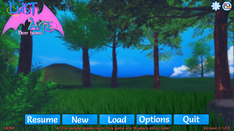 Ignore the background, it's just a random one for testing, the rest is what matters.
Yes, I've redesigned the icons and buttons. They now have a style more in line with the game's style.
The options menu has a similar style but with an extra touch: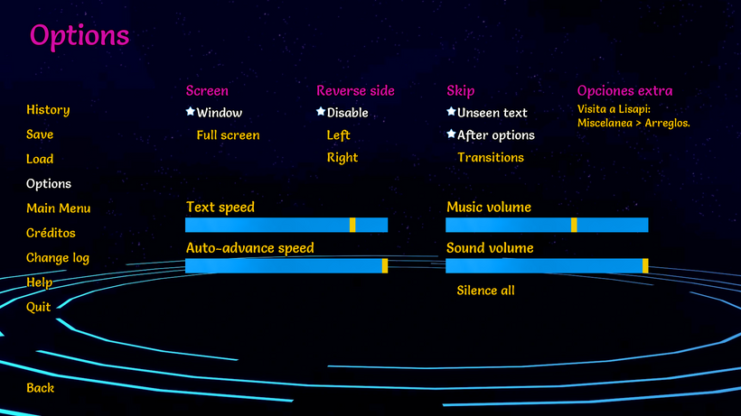
The change log is the one that has undergone the fewest changes so far: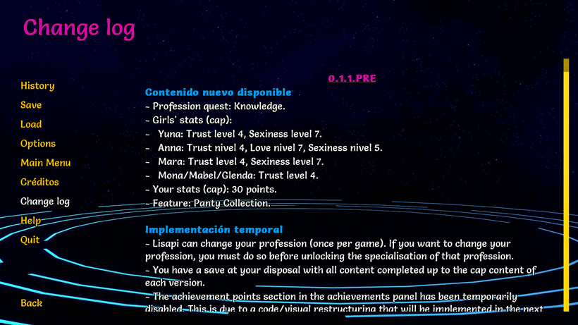 Everything still needs to be restructured appropriately, and I also want to add Robin's progress on the text revision so you can see how much has been revised, and corrected/improved.
After years of not touching this menu, I've decided to have a proper credits section: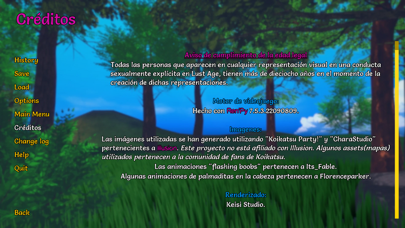
Not only that, but I've added the Kings to ‘The throne’: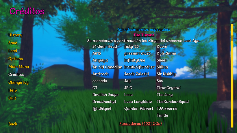
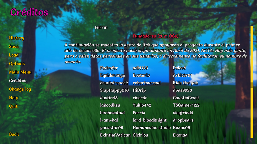
I've also added the OGs from 2021. Both patrons and people from Itch who supported the project during the first year of development: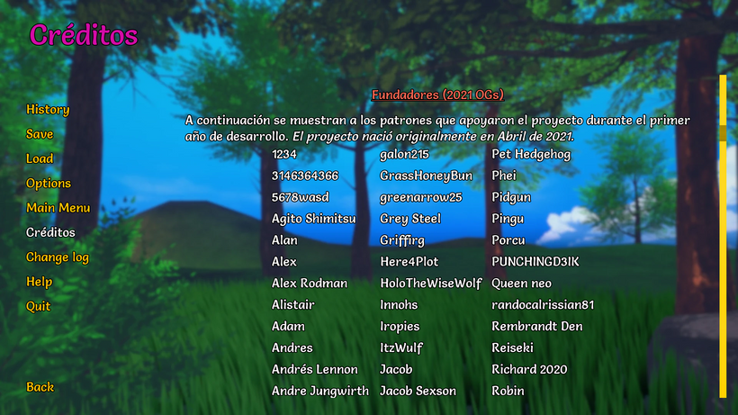
As this is a revamp/remake, I have decided that everyone who supports me during the first year of development (2025) will also appear exclusively in the credits: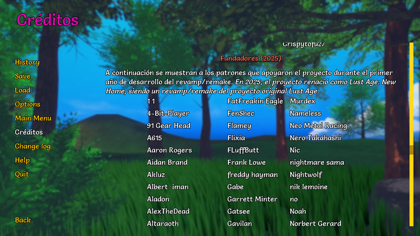
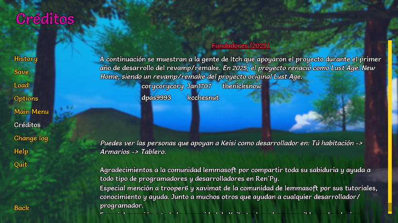
Unfortunately, on Itch, it's a pain in the ass because the csv file doesn't include the user's name, so to see that name, I have to go to the donation (one by one) and copy the name from there. And even then, not everyone adds their name, so...
On Patreon, it's easier, although it's quite an adventure. It has helped me learn how to handle csv files with many users. Quite an adventure, as I said.
Both the save and load sections have been slightly changed in design: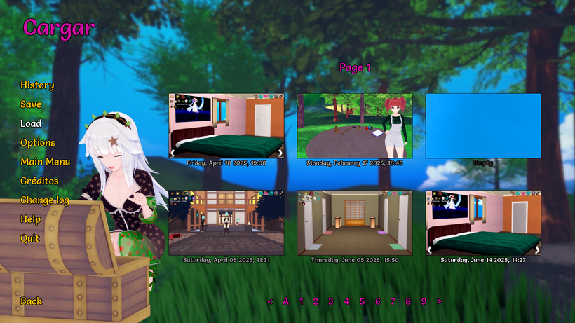
The load section, in particular, has a distinctive colour to avoid confusion.
On the other hand, we have some new small details in the quit screen: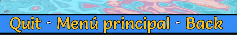
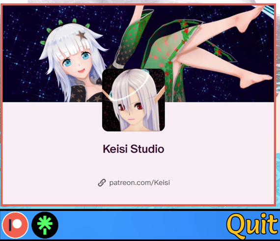
The most noticeable and obvious is that I've added the option to return to the main screen from there. I'm not sure if I'll change the order, but... You have to get used to it, as it looks a bit strange at first.
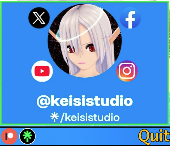
Yeah, I've also simplified everything related to my social media.
Another small detail, but worth mentioning:
I've changed the mail icon. Now the texture is more similar to the style of the other icons.
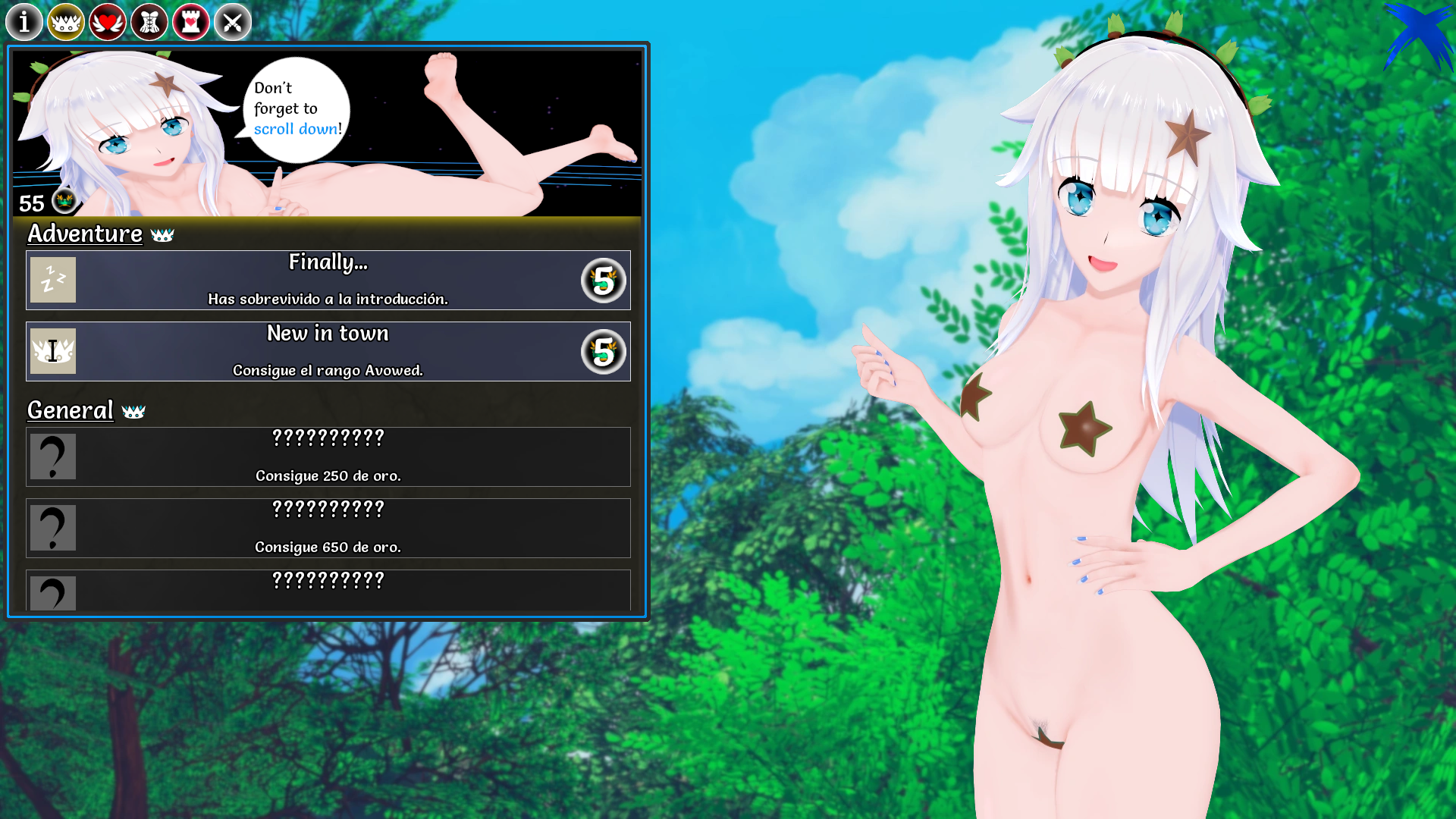
But... let's move on to this week's star feature: the achievements interface.
We all remember the current interface: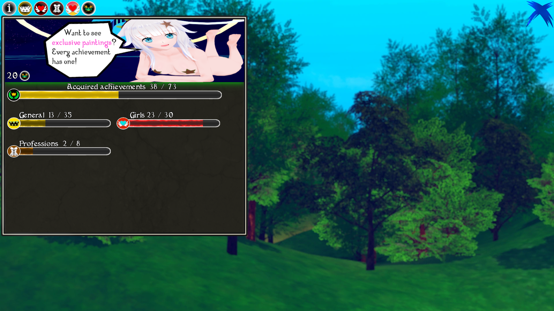
Well, now...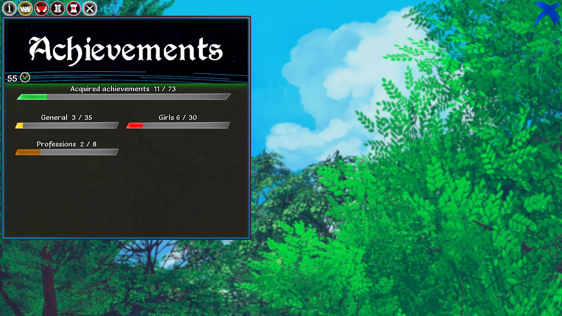
Oh boi... what a change.
Although the interface still has the same overall structure, it has changed quite a bit visually. This is before: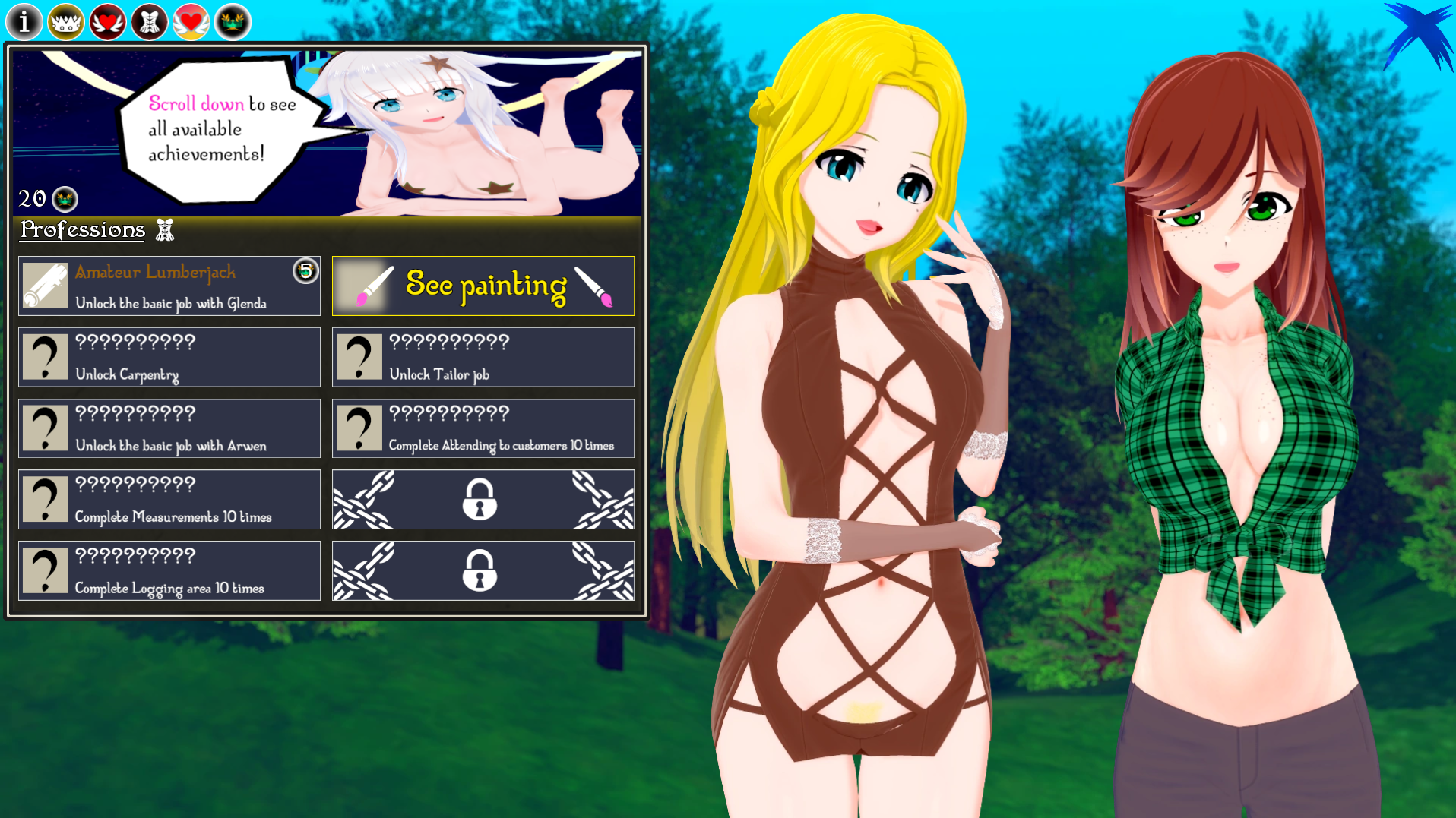
And now: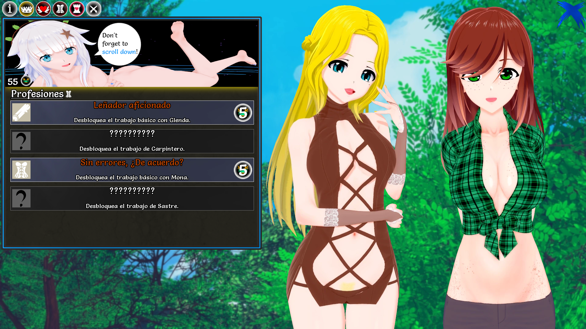

But there's more. Until now, to see the paintings (images) for each achievement, you had to go through each achievement one by one, like this:
Now everything is unified in one place, using the same structure as the gallery: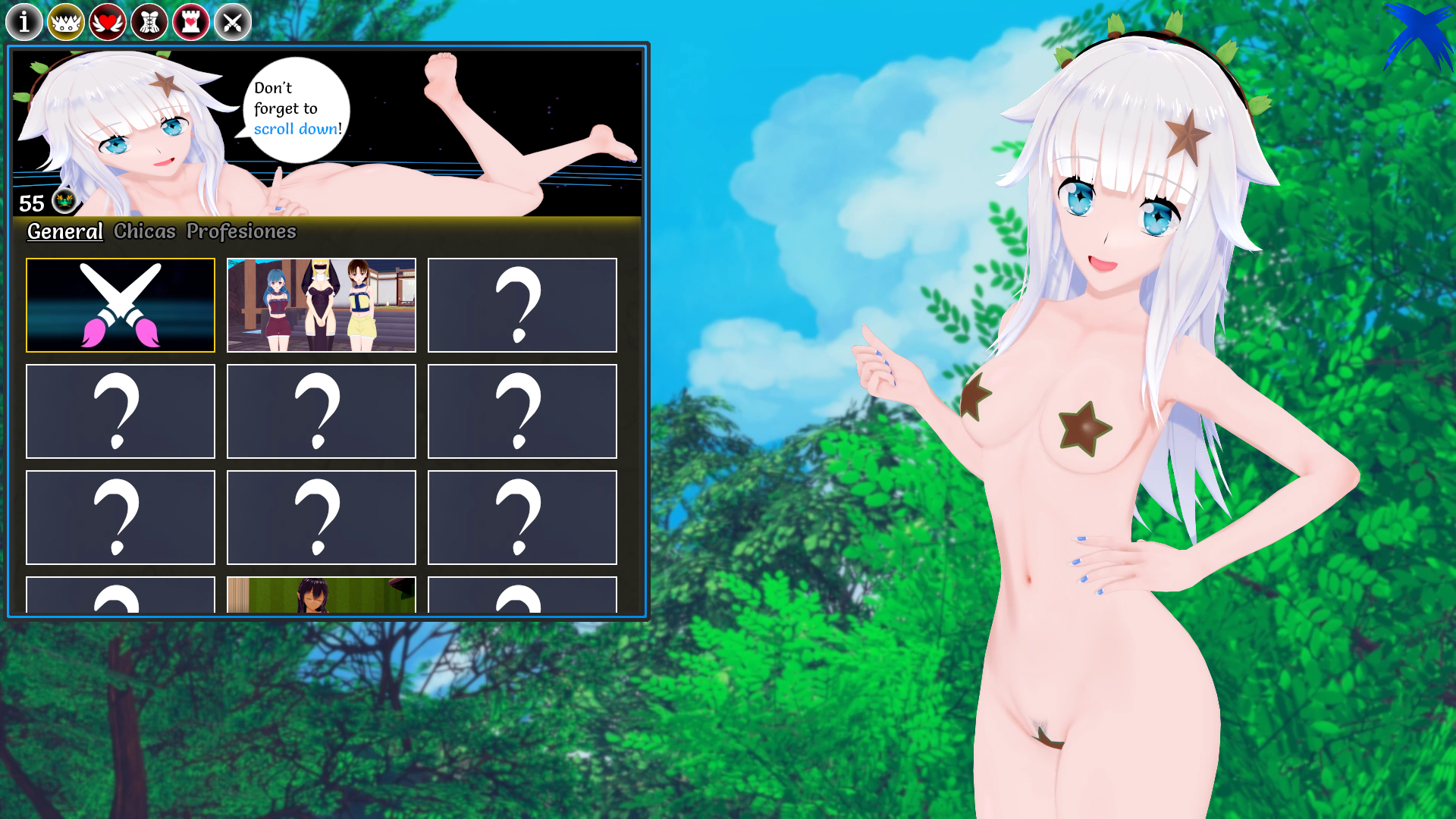
Thanks to this visual change, I took advantage of the opportunity to clean up and completely restructure the code, finally. Now everything has better consistency.
It has taken me quite a few hours of work; in fact, I am working overtime at night, but it has been worth it. Honestly, I am quite happy with the final result. I still have to finish polishing some details, but it should be the final version.
And although I've worked on other details here and there, they're more technical than anything else. I haven't worked on anything else this week, and honestly, although it's not much, it's honest work. No, but for real, it's a pretty significant change from my point of view.
For the moment, I'm not going to make any noticeable changes, such as the achievements interface, but over the next few versions, there should be more changes like that. If I had two more weeks (extra), I could possibly implement those changes in v1, but I'd rather spend the rest of the weeks working on new content for the girls, namely, redesigning the main core of the game.
Working on the main girls will probably take me a week, and working on the secondary girls will take another week. Reminder that the cap in v1 will be 5-7 (possibly 6). The secondary girls will probably have a cap at level 5.
For now, I want to focus on the main girls, as they are the ones who will give me the most headaches in terms of managing everything correctly.
All of this will be pre-seggs. I know it's a bit disappointing, but a new version is released every 1.5 months or so. Besides, I don't want to drive myself crazy; I prefer to release content gradually.
Once v1 is released, I'll slowly get back to the pace I've had so far pre-v1, and the releases should also change a bit, as I plan to release content more often, even if it's less content per version. We'll talk about it after the beta.
I'm looking forward to finishing all this because working more hours than I should sucks, my head isn't working as it should. The achievements have turned out better than I expected because I decided to take Monday off to rest, having worked all weekend. I think I'll do the same this week because I have a pretty crazy week ahead of me...
And that's all! I hope you like these changes, which give the game a refreshing new look. More things are coming, and as always, step by step, but everything will be definitive.
See you soon!
PS: Full res of the new interface stuff (Imgur).
ESPAÑOL:
Otra semana, otro log.
La semana pasada se me olvidó mencionar un pequeño detalle... la beta de esta versión deberia estar disponible aproximadamente a mitad de Julio.
Dicho esto, comenzemos con el post de hoy.
Esta semana a sido un poco caotica. Estuve como un día entero pensando en si debía intentar rediseñar por completo todas las interfaces, y para ello estuve mirando distintas opciones. Al final, decidí que iba a hacer un rediseño general, pero no. En realidad va a estar más enfocado en mejorar algunas interfaces existentes, y otras, rediseñarlas por completo.
No solo eso, si no que tambien hace tiempo que llevaba pensando si la fuente de letra de algunas interfaces debía ser cambiada, por lo que tambien investigué sobre el asunto.
Os muestro el resultado final de mi decisión:
Ignorar el fondo, es uno random para testear, lo importante es el resto.
Sí, he rediseñado los iconos y los botones. Ahora tienen un estilo más acorde a la admosfera del juego.
El menú de las opciones tiene un estilo similar pero con un toque extra:
El change log es el que menos cambios a sufrido por el momento:
Aún falta reestructurar correctamente todo y ademas, quiero añadir el progreso que Robin lleva en la revisión de los textos, así podreis ver hasta que parte está todo revisado y corregido/mejorado.
Despues de años sin tocar este menú, he decidido tener una sección de creditos en condiciones.
No solo eso, si no que he añadido a los Kings en el "The throne".
Tambien, he añadido a los OGs de 2021. Tanto patrones como gente de Itch que apoyó el proyecto durante el primer año de desarrollo.
Como esto es un revamp/remake, he decidido que toda la gente que me apoye durante el primer año de desarrollo (2025), tambien aparecerá de forma exclusiva en los créditos.
Desafortunadamente, en Itch, es un dolor en el culo pues en el archivo csv no se incluye el nombre del usuario, por lo que para ver dicho nombre, tengo que ir a la donación (una a una) y copiar el nombre de allí. Y aún así, no todo el mundo añade el nombre, así que...
En Patreon es más sencillo, aunque toda una aventura. Me a servido para aprender a manejar los archivos csv con muchos usuarios. Toda una aventura como digo.
Tanto la sección guardar como cargar, han sido ligeramente cambiadas en su diseño:
La seccion de cargar en particular, tiene un color distintivo para no dar lugar a confusión.
Por otro lado, tenemos pequeños detalles nuevos en la quit screen:
El mas notorio y obvio, es que he añadido la posibilidad de volver al menú principal desde ahí. No sé si cambiaré el orden, pero... hay que acostumrbarse, ya que se ve un poco raro al principio.
Tambien he simplificado todo lo relacionado con mis redes sociales.
Otro pequeño detalle pero que merece la pena mencionar:
He cambiado el icono del correo. Ahora la textura se asemeja más al estilo del resto de iconos.
Pero... vayamos a la estrella de esta semana: La interfaz de logros.
Todos recordamos la interfaz actual:
Pues ahora...
Mi lidel... vaya cambio le he hecho.
Aunque la interfaz a nivel general sigue teniendo la misma estructura, a nivel visual a cambiado bastante. Esto es antes:
Ahora:
Pero aún hay más. Hasta ahora, para ver las pinturas (imagenes) de cada logro, tenias que ir logro por logro, tal que así:
Ahora todo está unificado en un mismo lugar, usando la misma estructura que la galeria:
Gracias a este cambio visual, he aprovechado y por fin he hecho una limpieza y reestructura completa del codigo. Ahora todo tiene una mejor coherencia.
Me a costado bastantes horas de trabajo, de hecho, estoy haciendo horas extra trabajando por la noche, pero a merecido la pena. Honestamente, estoy bastante contento con el resultado final. Aun tengo que terminar de pulir algunos detalles, pero deberia ser la versión final.
Y aunque he trabajado en otros detalles aquí y allí, son más cosas técnicas que otra cosa. No he trabajado en nada más esta semana, y honestamente, aunque no es mucho, es trabajo honesto. No, es un cambio bastante significativo desde mi punto de vista.
Por el momento no voy a hacer cambios notorios como el de la interfaz de los logros, pero... a lo largo de las siguientes versiones, deberian haber más cambios como ese. Si tuviese 2 semanas más (extra) posiblemente podria implementar dichos cambios en la v1, pero prefiero dedicar el resto de semanas a trabajar en el contenido nuevo de las chicas aka rediseñar el core principal del juego.
Seguramente trabajar en las chicas principales me lleve una semana, y trabajar en las chicas secundarias me llevará otra semana. Recordatorio de que el cap en la v1 será de 5-7 (posiblemente 6). Las chicas secundarias posiblemente tengan el cap a level 5. De momento quiero centrarme en las chicas principales ya que son las que mas dolores de cabeza me van a dar para gestionarlo todo correctamente.
Todo esto será pre-seggs. Lo sé un poco decepcionante, pero a version nueva por mes o mes y medio... Además, no quiero volverme loco, prefiero ir sacando contenido paso a paso.
Una vez la v1 esté lanzada, volveré poco a poco al ritmo que he tenido hasta ahora, y las releases deberian tambien cambiar un poco, pues planeo lanzar contenido más a menudo aunque sea menos contenido por versión. Hablaremos de ello despues de la beta.
Tengo ganas de terminar todo esto porque trabajar más horas de las que debo, apesta, no rindo igual. Lo de los logros, a salido mejor de lo que esperaba porque decidí tomarme el lunes para descansar, pues estuve todo el finde trabajando. Esta semana creo que voy a hacer lo mismo porque me espera una semana bastante loca...
¡Y eso es todo! Espero que os gusten estos cambios que dan un aire refrescante al juego. Más cosas están por venir, y como siempre, paso a paso, pero todo ya será definitivo.
Nos vemos pronto!
Leave a comment
Log in with itch.io to leave a comment.